This guide provides the information needed to effectively use the Self-Service web-based graphical user interface (UI). The Self-Service UI is an intuitive interface providing access to all the functionality required by administrators, designers, and end-users. The Self-Service UI comprises four different views
that allow you to work with the various components and aspects of the product. The Admin View, Designer View, Catalog View, and CloudApps View are described in the following sections. It is important to note that each of the views may or may not be accessible depending on User Type. In addition, User Settings are accessible by all User Types and provide a way to define user-specific items such as time zone and notification preferences.
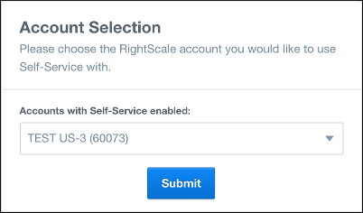
Account Selection
For Admins, Designers, and other users that may have access to multiple accounts, the Self-Service user interface provides controls for selecting which account is currently active. If you have access to multiple accounts and log into Self-Service you are presented with the Account Selection panel where you can choose which account you want to log into.
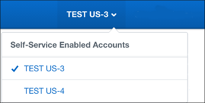
In addition, once you are logged in, the Self-Service Account Selector is available in the upper right corner of the user interface to provide a convenient method for switching between the Self-Service enabled accounts you have access to.
If you are working in either RightScale Cloud Management or Optima and use the Product Selector to switch to Self-Service, you will see different behavior depending on the account you are currently working in. If your currently active account is Self-Service enabled, you will be placed into Self-Service in that same account. If, however, your currently active account is not Self-Service enabled, then you will be presented with the Account Selection panel from which you can choose which account you want to view in Self-Service.
User Settings
As a Self-Service end-user you can set your local time zone and customize email notification. The User Settings page provides a variety of controls you can use to set your time zone preferences and customize the manner in which email notification is handled for your user profile. The various controls found on the User Settings page along with the steps to set your time zone and configure email notification are described below.
Accessing the User Settings Page
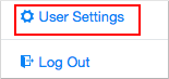
Access the User Settings page using the drop-down control located in the upper right-hand portion of the user interface.
Setting Your Time Zone Preferences
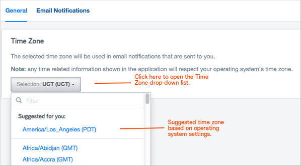
Use the following procedure to set your preferred time zone. The time zone you select will be used in email notifications that you receive.
- Open the User Settings page as described above.
- Open the Time Zone drop-down control and choose your preferred time zone setting. The control provides a suggested local time zone based on your operating system locale settings.
Customizing Your Email Notification Settings
Email Notification within Self-Sevice can be configured in two ways. First, you can set up default notification settings for any CloudApp that you launch or other users in your organization launch. Secondly, you can tailor individual notification settings for CloudApps that are already running. The following procedures outline the steps to configure your email notification settings for Self-Service CloudApps.
Note: Not all Self-Service users are able to view or configure email notification settings for CloudApps that other users in their organization have launched. Your user type (admin, designer, or end-user) and the Self-Service permissions granted to you (shared or private) determine whether or not you can view and configure email notification for CloudApps other than your own.
- Admins and designers can always view and configure notification on CloudApps other than their own.
- End-users must have shared permissions in order to view and configure notification on CloudApps other than their own.
- End-users with private permissions are only allowed to view and configure notification on their own CloudApps.
Navigate to the Email Notifications View
- Open the User Settings page as described above.
- Click the Email Notifications tab to expose the email notification configuration controls. Note that the Email Notifications view includes a top section used to specify your default email notification settings along with a second section used to configure or modify settings for running CloudApps that have already subscribed to notifications.
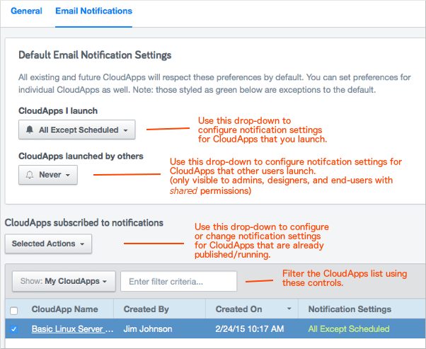
Configure Default Email Notification Settings
To configure the default email notification settings for your CloudApps, use the CloudApps I Launch drop-down list to define how you want email notifications to be handled for the CloudApps that you yourself will launch. Here you have the following choices for receiving notification.
- All Activity - get notified of all CloudApp activities such as launches, failures, when an operation executes, or scheduled operations.
- All Activity Except Scheduled Actions - get notified of all CloudApp activity except Scheduled Actions. (default)
- Failures - only get notified when a CloudApp fails.
- Never - do not get notified regarding any CloudApp activities.
Next, use the CloudApps Launched by Others drop-down list to define how you want email notifications to be handled for the CloudApps that other users will launch. Note that only admins, designers, and end-users with shared permissions have access to this control. This control is not visible to end-users with private permissions. Here you have the following choices for receiving notification.
- All Activity - get notified of all CloudApp activities such as launches, failures, when an operation executes, or scheduled operations.
- All Activity Except Scheduled Actions - get notified of all CloudApp activity except Scheduled Actions.
- Failures - only get notified when a CloudApp fails.
- Never - do not get notified regarding any CloudApp activities. (default)
Configure Email Notification Settings for Running CloudApps
To configure individual email notification settings for running CloudApps (launched either by you or other users in your organization), use the controls in the bottom portion of the Email Notifications view.
- Select one or more CloudApps in the available list. You can use the filter controls to help manage the number of displayed CloudApps. Note that the All CloudApps selection in the Show drop-down is only available to admins, designers, and end-users with shared permissions.
- Use the Selected Actions drop-down to define notification settings for the selected CloudApp(s). Here you have the following choices for receiving notification.
- All Activity - get notified of all CloudApp activities such as launches, failures, when an operation executes, or scheduled operations.
- All Activity Except Scheduled Actions - get notified of all CloudApp activity except Scheduled Actions.
- Failures - only get notified when a CloudApp fails.
- Never - do not get notified regarding any CloudApp activities.
- Revert to Default - re-set email notification to the default configuration.
Note: The Notification Settings column displays the currently defined setting for each CloudApp listed.
For notifications of upcoming scheduled operations on your running CloudApps. Self-Service will send notification one hour before a stop
operation and two days before a terminate
operation.
Overriding Default Notification Settings
You can override your default email notification configuration on individual CloudApps using the Notifications drop-down control.
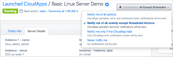
You can choose to be notified of all activity related to the selected CloudApp, only failures of the selected CloudApp, or you can elect to receive no notification at all.
The Admin View
The Admin View provides commands and functionality you use to administer the Self-Service portal for your organization. This includes customizing the color scheme and branding for your portal as well as specifying the permissions settings. Each of these functions is described in the following sections. To access the Admin View, click on the Admin icon in the navigation pane on the left-hand side of the Self-Service user interface. Note that the Admin View is only visible to users with administrator privileges in the associated RightScale Cloud Management (CM) account.
Customizing the User Interface
The UI and emails for Self-Service are fully customizable from the standpoint of branding and color scheme. To access the controls for customizing your Self-Service UI and emails, click the UI Customization tab in the Admin View. The user making these changes must have 'admin' role permissions on the account in Cloud Management.
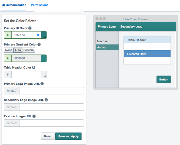
The UI Customization page provides a variety of controls to help you brand your Self-Service UI and emails for your organization. A convenient Live Color Preview allows you to see what your color selections will look like in the UI before you save and apply them.
- Primary UI Color - Specify the color for the top navigation bar, primary buttons, the active left-hand navigation element, and the header in emails. Enter the hexidecimal value representing the desired color or use the color picker by clicking the right corner of the control.
- Primary Gradient Color - Apply a gradient to the primary color by entering a hexidecimal value representing the desired gradient color or use the color picker by clicking the right corner of the control. Alternately, you can use the None, Auto, and Custom buttons to specify zero gradient, an automatic 10 percent gradient, or a custom color gradient respectively.
- Table Header Color - Define the color for all table headers in the Self-Service UI. Enter the hexidecimal value representing the desired color or use the color picker by clicking the right corner of the control.
- Primary Logo Image URL - Enter the URL pointing to the primary image for your company logo. This will be shown in the upper-left of the UI and will be centered in a header in emails.
- Secondary Logo Image URL - Enter the URL pointing to the secondary image for your company logo.
- Favicon Image URL - Enter the URL to the image that you want to use as the favicon that shows up in browser tabs and URL bars.
NOTES:
- HTTPS URLs are recommended to avoid 'insecure' warnings displayed in your browser.
- Limit the height of Primary and Secondary Logo images to 40 pixels to avoid image distortion due to re-sizing.
- Changes are applied immediately for all users in your organization.
Setting Permissions
In the future, Self-Service will allow you to organize your users into teams and give you the power to specify granular permissions to cloud resources. In the meantime, there is a simple permission setting that will allow you to restrict access to CloudApps for end-users in your organization. The user making these changes must have 'admin' role priveleges on the account in Cloud Management.
The Shared permissions option allows end-users and observers to view and access all CloudApps in the CloudApps View. The Private permissions option allows end-users and observers to only view and access the CloudApps that they have launched. Use the following steps to set the Permissions option.
- In the Admin View, click the Permissions tab.
- Select either the Shared or Private option.
- Click Save and Apply to store your permissions setting.
NOTE: The above permissions do not apply to users with 'designer' or 'admin' role on your account -- those users will have full visibility and control over all running CloudApps.
Managing Self-Service Only End Users
The Self-Service Only End Users tab allows you to view and manage users that have access to Self-Service on the given account but have no other permissions in Cloud Management or Optima. This can be leveraged to provide users with only access to the Self-Service app. In order for users to be eligible to be granted this special role, they must have no roles for the account in Cloud Management. For details on this functionality, see the Getting Started guide to Granting Permissions.
The Designer View
The Designer View is where you manage CAT files and schedule options used when publishing CAT files to the catalog. See Creating Schedules for more information on managing schedules.
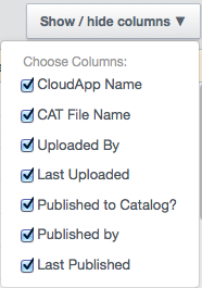
The main Designer View shows a list of all the CAT files that have been uploaded and compiled into CloudApps through the Self-Service UI. Each entry in the list shows the CloudApp name, the CAT file name, who uploaded the CAT, when the CAT was last uploaded, whether or not the CloudApp has been published, who it was published by, and when it was last published.
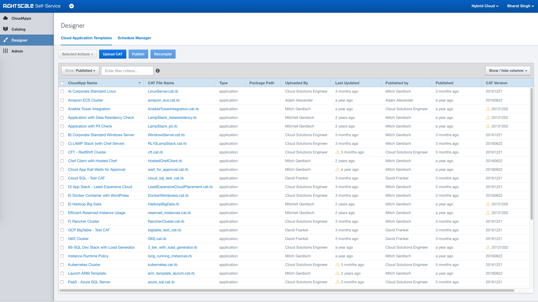
Use the Show/Hide Columns control to specify which columns are shown in the Designer View.
The contents of the Designer View can be filtered. Filtering choices in the Show drop-down include Published, Not Published, and Uploaded By Me.
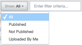
In addition to filtering using the Show drop-down, a text field is provided for further refinement of the filter.
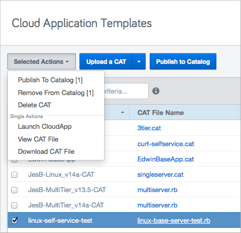
From the Designer View a number of single and bulk actions can be initiated on one or more selected CloudApps including Launch CloudApp, View CAT File, Download CAT File, Publish to Catalog, Remove from Catalog, and Delete CAT.
Additional Designer View Actions
In addition to the actions described above, there are several other tasks that CAT designers can accomplish in the Design view. These actions are shown below and described in the following sections. Also note that most of the single actions available in the Design view are accessible by left-clicking a CAT file entry.
Remove from Catalog
If you wish to remove a CloudApp from the CloudApp Catalog after it has already been published, select the CAT for the CloudApp and choose Selected Actions > Remove From Catalog.
It is not always possible for Self-Service to track the connection between a CloudApp in the Catalog and the CAT in Designer, so you can also navigate to the Catalog and select the Delete
button on any CloudApp to remove it.
Delete CAT
To delete a CAT file from the Design view, select the CAT file and choose Selected Actions > Delete CAT.
View CAT File
If you need to quickly examine the contents of a CAT from within the Design view, select the CAT file and choose Selected Actions > View CAT File.
Download CAT File
You can download a copy of the CAT file to your local drive by selecting the CAT and choosing elected Actions > Download CAT File.
Combined Actions
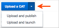
For your convenience the Design view also provides a way to combine some common actions. You can upload and directly launch a CAT (which may be helpful during a test phase), or upload and directly publish a CAT. To access these combined actions, click the disclosure triangle on the Upload a CAT button.
Catalog View
The Catalog View is where the majority of Self-Service portal users will go to see what CloudApps are available and to select a CloudApp to launch. Clicking Catalog in the left-hand navigation pane brings up the Catalog View.
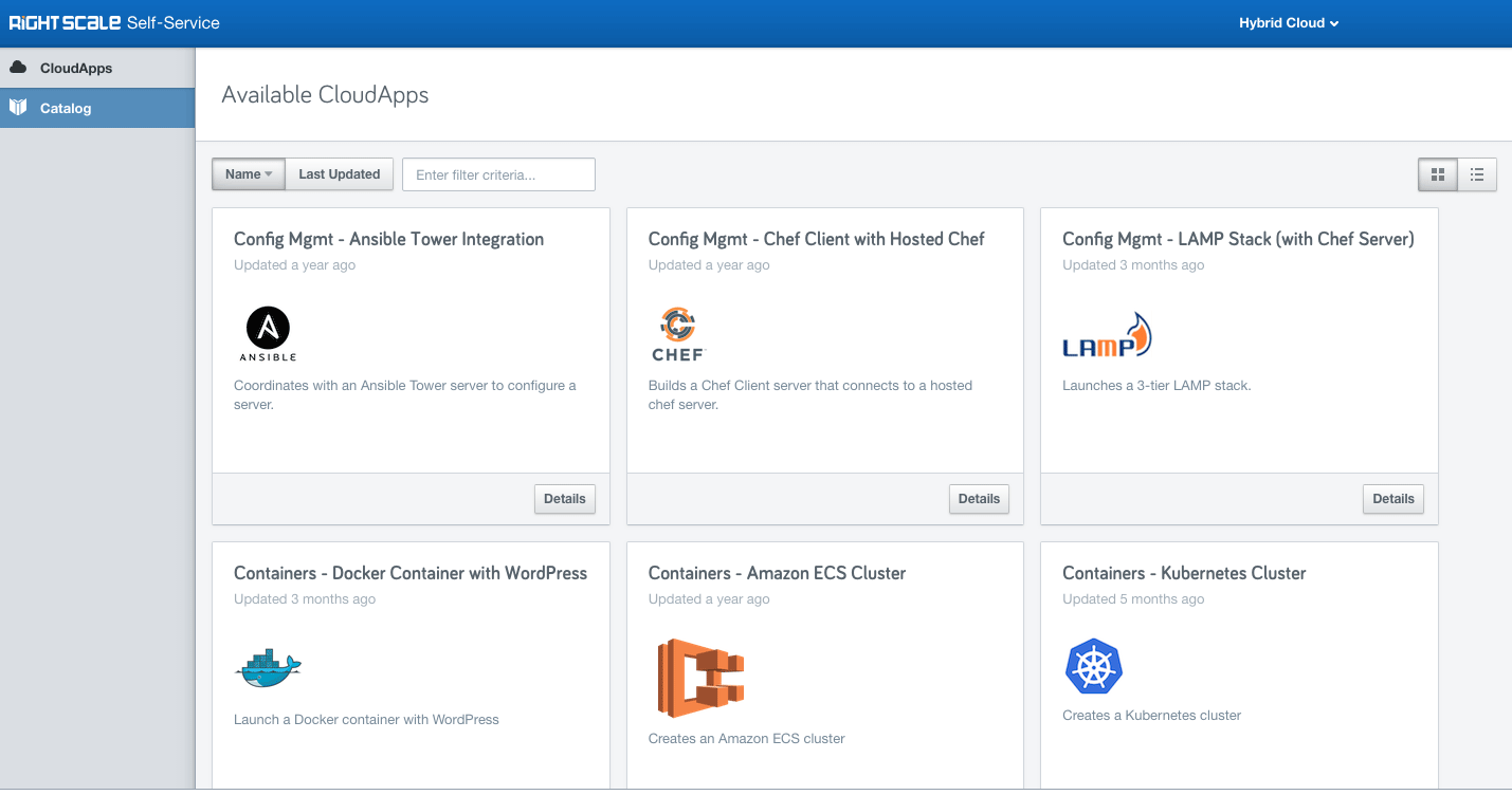
Setting the Display Mode
There are two display modes for the Catalog View - List View which shows the standard tabular view of the available CloudApps and Card View which displays each CloudApp as a tile. Toggle between the two display modes using the pair of buttons in the upper right-hand side of the UI.
Examining CloudApp Details
You can examine the details regarding a given CloudApp by clicking the Details link in List View or the Details button in Card View.
Launching a CloudApp
Launching a CloudApp is easily accomplished by either clicking the Launch link in List View or the Launch button in Card View. The following dialog displays with fields for entering the name you want to use for your launched CloudApp as well as a description. You can also specify a runtime schedule and an end date for the CloudApp using the Schedule and End CloudApp On controls. In addition, any parameters that are specified in the CAT are presented in the dialog as drop-downs or text fields.
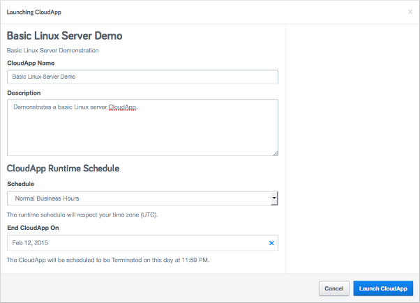
Click Launch CloudApp to start the launch.
Viewing CloudApp Details
Once the CloudApp has launched successfully, a screen similar to the following appears showing various information about the running CloudApp including run status, uptime statistics, a log of recent activity, and output values grouped by category. Each section or 'card' on this page is explained in greater detail in the following sections.
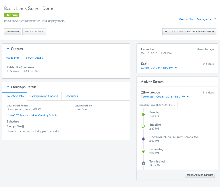
CloudApp Header
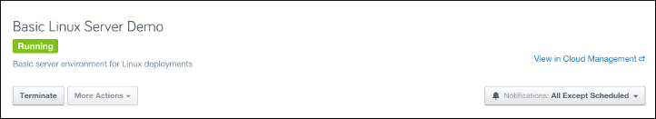
The Header lists a number of operational aspects of your running CloudApp:
- CloudApp Name - the name of the running CloudApp
- Current Status - running, terminated, etc.
You can also take a number of actions using the controls in the Header:
- Terminate the CloudApp
- Initiate any custom actions that the CloudApp may have
- View the CloudApp in the Cloud Management Dashboard
- Change Notification Settings
CloudApp Outputs Card
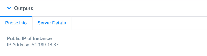
The Outputs card lists and describes the available outputs from the CloudApp and is divided into two tabs.
- Public Info - displays the public IP Addresses of the one or more Instances that have been launched by the CloudApp.
- Server Details - displays a variety of information on the CloudApp resources including Name, Cloud, Datacenter, Instance Type, etc.
CloudApp Details Card
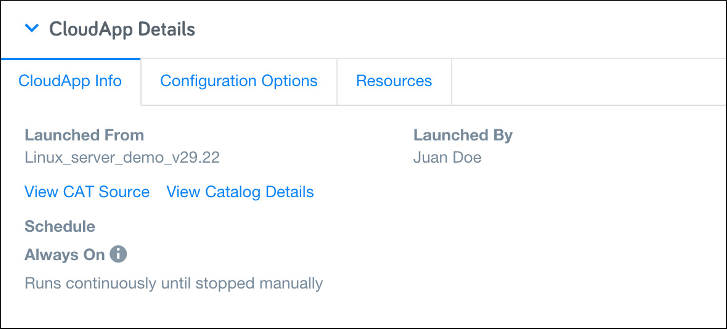
The Details card provides additional information on the CloudApp and divided into three tabs.
- CloudApp Info - lists information on the CAT the CloudApp was launched from as well as who launched the CloudApp and what Schedule it was launched with. In addition, you can view the CAT source for the CloudApp and launch a new test version of the CloudApp from this tab.
- Configuration Options - lists the Cloud/Region for the CloudApp as well as the instance size, operating system, etc.
- Resources - lists the various resources (instances, server arrays, servers, volumes, etc.) launched by the CloudApp.
CloudApp Schedule Events
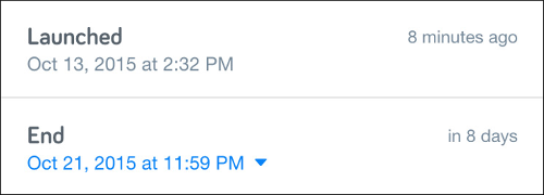
The Schedule Events card displays the launch date/time for the CloudApp as well as the currently configured End Date. You can modify the End Date by clicking the link and selecting a new date/time from the displayed date picker control.
CloudApp Activity Stream
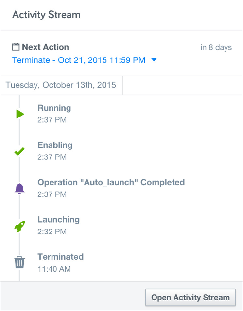
The Activity Stream card displays a chronological history of the various CloudApp events that have fired during the current run period. The most recent events are visible in the card but you can click the Open Activity Stream button to see the complete list of events. The Next Action is also displayed at the top of the card and you can change or cancel the Next Action by clicking the link and making your selection from the popup menu.
CloudApps View
Clicking the CloudApps icon in the left-hand navigation pane retrieves a list of all the CloudApps that have been launched in your environment. For each CloudApp a variety of useful information is displayed including status (running, terminated, etc.), the execution name of the CloudApp and the CAT file it is based on, the owner and when it was created, and the elapsed runtime. From here you can perform a variety of administrative actions such as launching and terminating CloudApps, viewing details about a CloudApp, examining the source (CAT) for the CloudApp, and viewing the CloudApp Deployment in CM.
Setting the Display Mode
Similar to the Catalog View there are two display modes for the CloudApps View - List View which shows the standard tabular view of the launched CloudApps and Card View which displays each CloudApp as a tile. Toggle between the two display modes using the pair of buttons in the upper right-hand side of the UI.
Selected Actions
As the Self-Service administrator you can execute actions on individually selected CloudApps or bulk actions on two or more selected CloudApps. Checkboxes on the left-hand side of the view allow to easily select the CloudApps you want to work with. Clicking the Selected Actions drop-down exposes the actions available to you for the selected CloudApps.
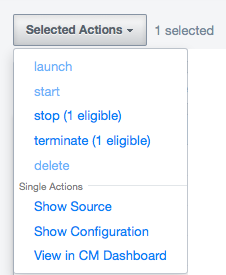
The following bulk actions are available from the Selected Actions drop-down.
- Launch - initiates a launch of selected CloudApps that are currently in the Terminated state.
- Start - starts selected CloudApps that are currently in the Stopped state.
- Stop - stops selected CloudApps that are currently in the Running state. NOTE: If the CAT does not have a
stopoperation defined, theterminateoperation will be run instead. - Terminate - initiates a termination of selected CloudApps that are currently in the Running state.
- Delete - deletes selected CloudApps
The following single actions are also available when only a single CloudApp is selected.
- Show Source - displays the CAT source code for the selected CloudApp in a convenient modal viewer.
- Show Configuration - displays information about the configuration of the CloudApp including parameter values.
- View in CM Dashboard - launches a separate browser window and displays the CloudApp deployment in RIghtScale CM.
Filtering and Columns
You can configure the display of CloudApps in the CloudApps View by using the Filter control, Date Launched button, Name button, and the Show/Hide Column control. The Filter drop-down and edit field lets you specify exactly which CloudApps you want to view by providing preset filter groups and free text entry.
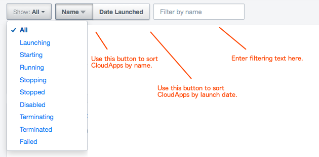
Using the drop-down control you can select any of the standard CloudApp states to filter on. You can also enter a text string in the edit field to provide additional filtering criteria. Within the edit field you can use special syntax to further refine your search as follows:
- Use
:(colon) to filter on specific columns. For example, [ColumnHeader]:[value] - Use
|(pipe) to OR multiple values. For example, Status:Running|Provisioning - Use
;(semicolon) to AND multiple filters. For example, Status:Running;Linux
You can use the Show/Hide Columns control to further tailor the display in the CloudApps view. Click the Show/Hide Columns control to open the drop-down list.
Select/de-select the columns that you want to display and click the control again to close the drop-down.