Objective
To create and view Cluster Monitoring graphs for a deployment with many servers.
Prerequisites
Collectd must be installed on the instance for monitoring to work. Most ServerTemplates include this as part of their boot phase. If yours do not, see Setting up collectd for more information.
Background
Many RightScale customers have deployments with hundreds or even thousands of servers in them. Looking at standard monitoring graphs is not very practical for deployments with many running servers. Cluster Monitoring makes this process simpler and more effective. With Cluster Monitoring you have the ability to filter all servers in a deployment by the ServerTemplate name they used, the actual server name itself, or a Tag. You can specify a specific value to filter against, or a \*
to match against all strings. (That is, all ServerTemplate names, all server names, or all Tags.)
Use Cases
The following example use cases may help give you ideas on how you can better use Cluster Monitoring.
Server Name
As an example, in your deployment that includes availability across the US and EU, you could Cluster Monitor
all of your EU servers, US servers or all front end (FE) servers across both regions, given that EU
, US
and/or FE
were part of your server naming convention scheme. At a glance you could see if any of these Servers struggled with low CPU idle time, too much Apache/web traffic, etc.
Tagging
As another use case, if your deployment uses database sharding, you could tag each shard with a descriptive name based on account numbers. For example, tag them with this basic naming convention:
- shard 0-2000
- shard 2001-4000
- shard 4001-6000
- . . . (and so on)
Then you would simply apply a filter by tag shard
in order to access all Cluster Monitor graphs for your database shard servers.
ServerTemplate
Lets say you discover that a customized ServerTemplate may have developed a memory leak. The suspected ServerTemplate is called Custom PHP App
. You could filter by ServerTemplate on custom php app
and all servers based on this ServerTemplate would be viewable in your Cluster Monitoring Graphs. From there, you could step through various server graphs viewing memory data. If the server free memory graphs are sloping, you may have identified a trend that confirms your memory leak suspicions.
Note that these example use cases are in addition to configuring monitoring and Alerts with Alert Escalations, etc. That is, Cluster Monitoring does not prohibit you from setting up Alerts the way you are accustomed to any more than standard monitoring graphs do. Both are additional features, orthogonal to automated alerts and escalations.
Overview
Screen Layout
Understanding the basic screen layout allows you to create and view Cluster Monitoring graphs more effectively. At first, the layout and various operations may not seem obvious. This brief Overview of the screen layout will help you grasp the screen and its functions more quickly. When viewing the Monitoring tab of your deployment, your main focus should be the following three areas:
- Design area
- Standard graphs
- Cluster Monitor graphs
A dotted line separates the three areas from each other
Design Area
The design area is at the top of the Monitoring display area and is where you specify whether you want to create and display new standard graphs -OR- Cluster Monitor graphs.
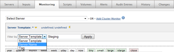
The following screen shot shows the design area in the process of:
- Add Cluster Monitor (action link)
- Filter by ServerName (selection highlighted)
- Name =
Staging
Once applied, the resulting set of servers that display Cluster Monitoring graph data is all servers in the current deployment that contain staging
in their name.
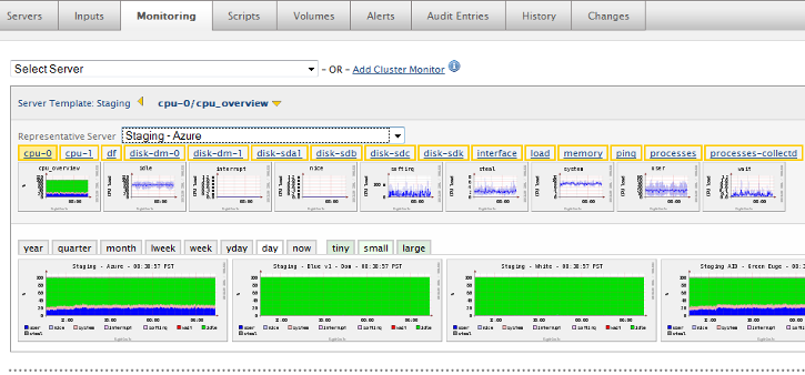
After selecting the Apply action button, several graphs are added to the design area. The next example shows this. The key points of interest to note are:
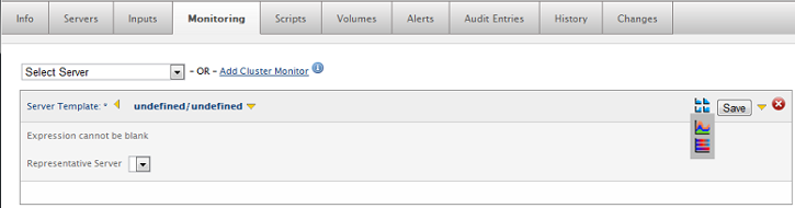
Representative Server
A single server is always shown after applying a filter in the design area. In our example, this is the Staging - Azure
server. This single server is known as the Representative Server. The screen area is too small to show all servers, so a representative server is shown, with the option of drilling down to other servers.
Thumbnail Graphs Below the Representative Server
These thumbnail graphs show all of the monitored data for that individual Representative Server. As a starting point the metrics for cpu-0/cpu_overview
are displayed.
- If you select any of the collectd plugins (metrics outlined with gold boxes) then the thumbnail graphs will reflect that metric.
- If you select any of the thumbnail graphs, then that metric (e.g. cpu overview, idle, steal, etc.) is displayed for each of the monitoring graphs below the thumbnail graphs.
Representative Server Drop Down Menu
A list of all servers in the result set of the filter that was applied. (Servers with staging
in their name in our example.) You may select or browse through any and all servers in this list. If you select a different Representative Server the graphs immediately below them are changed to correspond to the collectd data for that server.
Monitoring Graphs Below the Thumbnail Graphs
A graph for each Server in the Representative server drop down is shown. (Note: Example screenshot is truncated for display purposes.)
Save Action Button
Select the Save action button (not shown) to save graph data from any filters you have run/displayed. The saved graphs are placed at the bottom of your Monitoring display, and your browser is automatically placed at the bottom.
Standard Graphs
Standard monitoring graphs appear below the design area, above any Cluster Monitor graphs, delimited by the dotted line as shown. See Viewing Monitoring Dashboards for more information on standard graphs. The functionality of standard monitoring graphs has not changed with the advent of Cluster Monitoring.
Cluster Monitor Graphs
Cluster Monitor graphs display at the bottom of the Monitoring display, below the standard graphs. There is (virtually) no limit to how many Cluster Monitor graphs you can save. Once saved (by selecting the Save action button), you can perform the following basic operations on the graphs in the Cluster Monitoring display area:
 Drag/Drop the graph
 Delete the graph
 /
/  Expand/collapse the graph
Once you save Cluster Monitoring graphs, a design area for Cluster Monitoring is placed at the top of the displayed graphs. Its like having a header on your Cluster Monitoring graphs section, so that you don't have to scroll back up to the top of your entire Monitoring display in order to change the contents of an individual Cluster Monitor. It functions the same as the design area at the top, except you don't have the choice of selecting standard graphs or Cluster Monitor graphs. Cluster Monitor graphs are implied by the location. This feature is simply for ease of use, there is no added functionality here.
Cluster Monitor Heat Maps and Stacked Graphs
This feature is only supported for AWS and Google.
When enabling cluster monitoring, you have the option of choosing to view your graphs in hosts,
heat
or stack
:
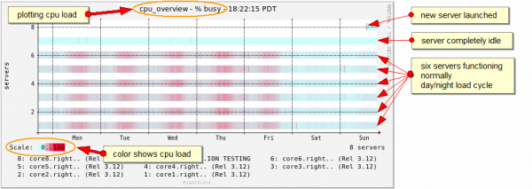
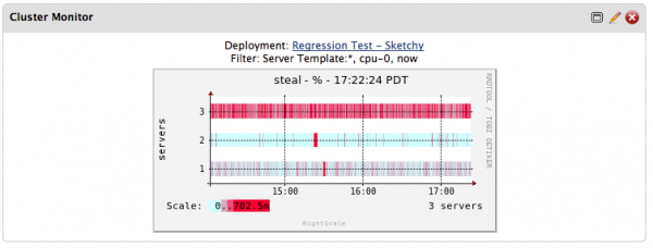
Heat maps show a different view of the same action. In a heat map, each color bar represents the activity of a server and the color of the bar at each point in time, showing how hot
the server is. For example, the value of the variable being displayed color coded from blue to red:
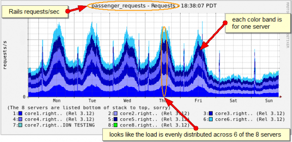
A stacked graph is an effective alternative for displaying many servers on one graph where the activity of each one contributes to a total or sum. Each color band shows the requests/sec for one server, and the color bands are stacked on top of one another in a way that allows you to read the requests/sec served by the application at the top. Stack graphs give a thorough overview of what is transpiring in sum:
Add a Cluster Monitoring Widget
Users can add a Cluster Monitoring Widget to the Dashboard in two ways: either through the Dashboard or from the Monitoring tab of a Deployment. Cluster Monitoring Widgets help users view the health of their Deployments directly from the Dashboard Overview tab.
Add a Cluster Monitoring Widget from the Dashboard
- Navigate to Design > Widgets.
- Click on the Built-in tab.
- Click Add for the Cluster Monitoring Widget.
You are prompted to specify a Deployment at which point you are presented the fields that help define your Cluster Monitoring Widget.
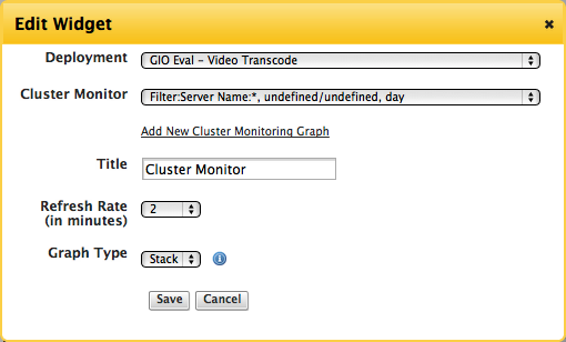
- Cluster Monitor - Choose the Cluster Monitoring graph you created in the Monitoring tab to be used for your Widget or add a new Cluster Monitoring graph.
- Title - Name your Cluster Monitoring Widget.
- Refresh Rate - Specify in minutes how often you want your Cluster Monitoring Widget to be refreshed.
- Graph Type - Choose between Heat Map or Stacked Graph for your Cluster Monitor to be displayed in the Widget.
Click Save.
Your Cluster Monitoring Widget will be editable directly in the Dashboard.
Add a Cluster Monitoring Widget from a Deployment
If a Cluster Monitor does not already exist for a Deployment, you must navigate to a Deployment with running Servers in order to enable Cluster Monitoring.
- After choosing a Deployment with running servers, click Add Cluster Monitor
Filter by ServerTemplate, Server, or Tag from the dropdown menu. You can also click Apply without choosing a filter to get all of the Servers in your Deployment to be included in the Cluster Monitor.
- Click Apply.
- Select either a Heat Map or Stacked Graph to view your Cluster Monitor graph.
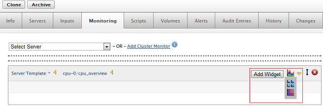
- Click Save.
- Click Add Widget.
Your Cluster Monitor graph is added as a Widget to the Dashboard. You can then edit your Cluster Monitoring Widget directly in the Dashboard.
Monitoring Parameters and Limitations
Be aware of the following parameters and limitations surrounding Cluster Monitoring when working with this feature:
- Servers are always within a single deployment. The result set of servers to monitor never spans multiple deployments.
- In order to maximize screen space, the graphs are scaled to fit the screen (so that up to six could be fit in line horizontally)
- There is no extra large (xlarge) view the way as with standard monitoring
- Saved graphs are only sortable and movable (drag/drop) within their respective screen areas for standard and Cluster Monitor graphs. (That is, you cannot intersperse standard graphs and Cluster Monitor graphs.)
- There is a maximum of 100 graphs. When the graph ceiling of 100 is reached, which 100 to include in the result set of Representative Servers follows a basic algorithm. A percentage of the following are included:
- Most recently launched
- Operational servers
- Stranded servers (if any)
- Oldest
- Based on each kind of ServerTemplate
- The remainder of the 100 are a random sampling of servers
- Note: Currently, there is a limit of 100 total servers, and the
percentage
for each of the above is set at 10%. However, these figures may be fine tuned in a future release.
- Stacked graphs only display information from one cloud. Only graphs for servers of the same cloud as the representative server (for the cluster) are displayed.
Steps
Navigation
- Manage > Deployments > ... Select a Deployment with many running Servers ... > Monitoring tab
- Select the Add Cluster Monitor action link
Create a Subset of Servers to View
- Select a Filter by criteria. You have three choices:
- ServerTemplate
- Server Name
- Tag
For example, select Server Name from the drop-down menu
- Specify a criteria that will create a subset (or result set) of servers to view. For example, you may want to Filter by Server Name where the name has
Staging
in it, orfrontend
. By default, a\*
(match everything) is placed in the filter by contents window for you. This is often ok, but sometimes it does not trim down the result set of servers that you want to view. - Select the Apply action button
- A Representative Server and its associated graphs display.
View Various Cluster Monitoring Graphs
As discussed earlier, you may want to fine tune your filter, look at several Representative Servers, and/or zoom in on graphs. Along the way, you can save various graphs for further analysis.
Post Tutorial Steps
Drilling Down on a Specific Server
Sometimes you may want to drill down on a specifc server when using Cluster Monitoring. You may want to drill down to a specific server when:
- You need to look at the graphs of multiple servers
- You notice some sort of anomaly (such as low CPU idle time on a given server)
- You want to right click on that Server's graph > Open link in a new Tab
- You are placed in Monitoring for that specific server (with original Cluster Monitoring still opened up)