Overview
Widgets are objects that display in the Cloud Management Dashboard's Widgets tab. You can use RightScale Widgets to create your own custom Widgets page within the Dashboard. When using Widgets you can select from several Built-in Widget Definitions or create your own custom Widget Definition and then add an instance of those Widget Definitions to the Dashboard. Widget Definitions are account based and shared among users of an account. Instances of Widgets, added to the Dashboard, are user and account based. Therefore, instances of those Widgets added by an account user are unique to that user.
The Dashboard Widgets page is pre-populated with built-in Widgets. These Widgets help give a detailed overview for a user, and can be removed and re-added accordingly. To access Built-in Widgets, navigate to Design > Widgets and view the Built-in tab. Custom Widgets are the Widgets you create. These Widgets are stored under Design > Widgets in the Custom tab.
Customizing the Widget Display Area
By default, when adding a Widget to the Dashboard, the newest Widget is added to the upper left of the Widget display area in the Widgets tab. The Widgets display area is customizable. The Widgets can be moved within two display columns by dragging and dropping to the desired location. You can also expand or shrink the Widget. The Expand/Shrink action button is located in the upper right corner of each Widget.
The Expand/Shrink action button is currently unavailable for some Built-in Widgets.
Once you create a Widget Definition, you can add it to the Dashboard. You can also edit it or delete it. When viewing the Widget Definition, simply use the Edit, Delete , and Add action buttons as appropriate.
Widget Inputs
Inputs are generic, user specified, user configurable parameters that are available for use within the Liquid body rendered within a Widget. For example, rather than hard coding the color yellow to highlight a stranded server (see the Liquid body syntax for the Servers Example
below) simply specify a configuration parameter in the Liquid body syntax that dynamically gets replaced with a color value when you add the Widget Definition.
Benefits of Using Inputs
One of the benefits of having user configurable parameters is that you can customize each individual use of a Widget Definition differently than another. Looking at the Widget Definition for the following Servers Example
, the background-color as yellow has been hard coded into the Liquid body syntax. This means that each use of this particular Widget Definition displays the background-color as yellow for the specified condition.
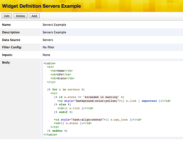
However, what if you wanted yellow in one Widget Definition use, but red in another? Without using configuration parameters, this would require two separate Widget Definitions, identical in syntax, with the exception that the background-color is specified as yellow in one and red in the other. This is a perfect example of when using a configuration parameter can be extremely beneficial. Rather than hard coding the desired background-color value directly into the Liquid body syntax, a configuration parameter can be used instead.
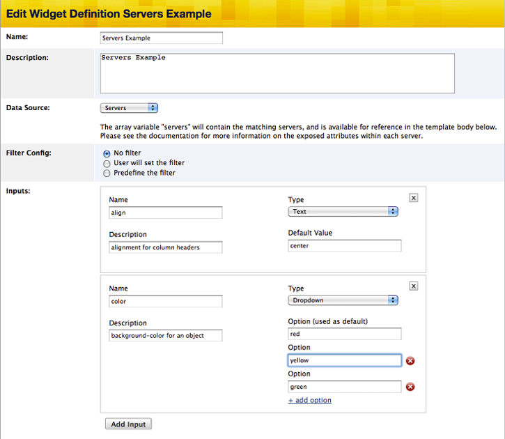
The following example uses a configuration parameter (rather than a hard coded value) to specify the background-color of an object. Note the definition of the configuration parameter color in the Inputs area, and the usage of the config.color configuration parameter in the body syntax:
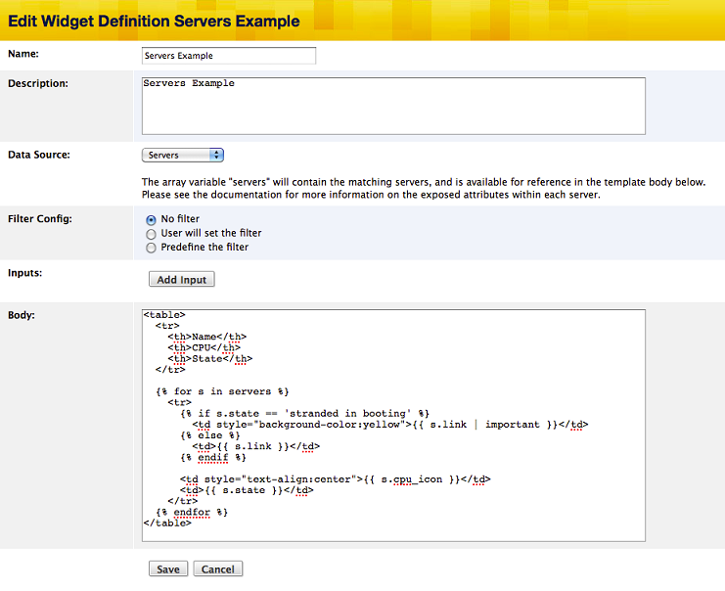
Configuration Parameters
Configuration parameters, defined in the Inputs for a Widget Definition, are available for use within the Liquid body syntax as config.<name>. In the Widget Definition, the parameters can be defined with default values. You can override these default values when the Widget Definition is added to the Dashboard or to a deployment. Here is an example of overriding the default value yellow with red (for the color configuration parameter) when adding a Widget Definition:
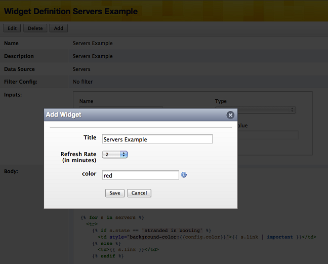
Using configuration parameters allows for different customized uses of the same Widget Definition. For example, two Server Example
Widgets can use the same Widget Definition, but with different values for the color configuration parameter:
Creating Inputs
The following examples use an existing Widget Definition, but you can apply the same steps when creating a new Widget Definition. To add a configuration parameter, click on the Add Input button in the Inputs area of the edit page.
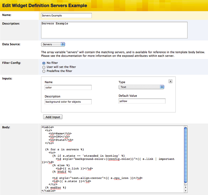
Each time that you clicke Add Input , you see a set of objects that you can use to define the desired configuration parameter. When you change the Type from 'Text' to 'Dropdown' you see a different set of options.
Adding multiple configuration parameters
You can add multiple configuration parameters to a Widget Definition, one 'Text' and one 'Dropdown,' by clicking the Add Input button and selecting the 'Type'. Both 'Text' and 'Dropdown' configuration parameters require the following basic pieces of information:
- Name - The name of the configuration parameter
- Type - Representation type of the configuration parameter: 'Text' or 'Dropdown'
- Description - A text description explaining the purpose of the configuration parameter
'Text' configuration parameters accept one more piece of information:
- Default Value - The default value for the named configuration parameter
'Dropdown' configuration parameters require additional information. To add an option for a dropdown, click + add option, then supply the option value(s):
- Option - One of the values to be displayed in the dropdown (for example, if the configuration parameter is named 'color,' then its values might be 'red,' 'yellow' and 'green'). The first option is used as the default value.
Repeat these steps as desired.
The configuration parameters that were defined are implemented when adding a Widget Definition to the Dashboard.
Using Inputs
You can see each configuration parameter as available for configuration when adding a Widget Definition and you can can also modify them after adding them to the Dashboard. Change the configuration parameters by entering or selecting a new value for the desired parameter.
Actions and Procedures
Add a Widget
Use the following steps to add a Custom or already-existing Built-in Widget to your Dashboard Overview page.
Add a Built-in Widget
To add a built-in Widget Definition to the Dashboard:
- Navigate to Design > Widgets > Built-in tab
- Click the Add button next to the desired Built-in Widget Definition
Add a Custom Widget
- Navigate to Design > Widgets > Custom tab
- A dialog box is displayed
Configure the following parameters as desired:
- Title - Text displayed in the title bar of the Widget.
- Filter by - If filtering is available, choose the filter type, and the corresponding filter value (if applicable). See Filter Configuration for more information. Filter value is not displayed if filter type is set to
None
. - Refresh Rate - Number of minutes between times the Widget will automatically refresh its contents.
Once the Widget is saved, it is added to the Dashboard, and context is redirected appropriately.
Create a New Widget
Use the following steps to create a new Widget Definition for use in the Dashboard Overview page.
Creating a New Widget Definition
- Navigate to Design > Widgets
- Click the New Widget action button
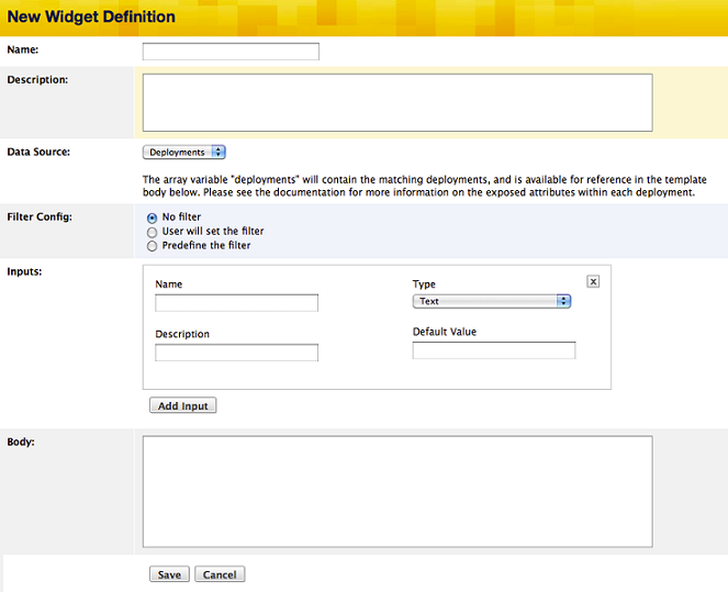
Then enter the Widget Definition information:
- Name - The name of the Widget Definition.
- Description - Text describing the Widget Definition.
- Data Source - Choice of 'Deployments' or 'Servers' or 'Alerts'. Default is set to 'Deployments'.
- Filter Config - Choice of filter configuration.
- Inputs - Configuration parameters for use within the Liquid body.
- Body** - Code to be rendered by the Liquid template.
Click Save.
Filter Configuration
You can configure filtering for a Widget Definition in three ways:
- No filter - No filtering is available and filtering options will not be presented to the user when adding a Widget.
- User will set the filter - The author specifies which filter types are available when creating the Widget Definition. When adding a Widget, the user can pick from the available filter types and specify the filter value.
- Predefine the filter - The author defines the filter type and filter value in the Widget Definition. You cannot change the filter configuration when adding a widget and you will not see any filtering options. Each time a Widget is added, you must use the predefined filtering configuration in the Widget Definition.
Add a Cloud Credential Status Widget
If you have a standard account, you can add the Widget to your Dashboard Widgets tab. If that account has admin
privileges, then you can Edit and Delete after clicking the cloud hyperlink in the Services column (see screen shot below). If you do not have admin
privileges, you can view the information but cannot make changes to it.
The Built-in Cloud Credential Status Widget reports on credentials for each cloud in your account. For example, the following screen reports positive credential status for three different clouds in the current account. *
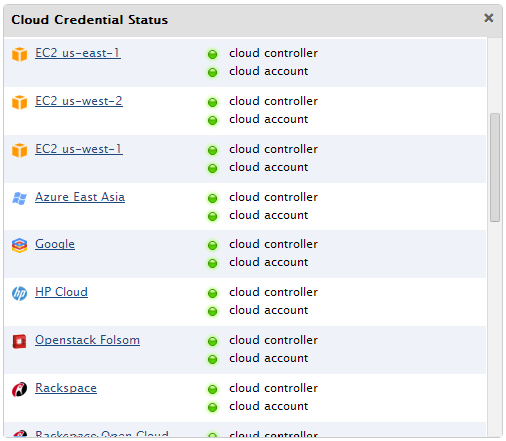
Status of your cloud credentials.
- Cloud Controller - Cloud's API server. A green sphere means it is responding to requests. Otherwise its state is
unknown
. - Cloud Account - A green sphere means that we can make an authenticated request to the Cloud Controller and get a response. (Otherwise
unknown
.)
This information is also reported from the Settings > Account Settings > Clouds tab screen in the Dashboard.
* Online - You have valid credentials and we can make a request to EC2 with them and be properly authenticated.
Add a Cluster Monitoring Widget
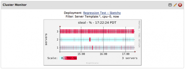
Users can add a Cluster Monitoring Widget to the Dashboard in two ways: either through the Dashboard or from the Monitoring tab of a Deployment. Cluster Monitoring Widgets help users view the health of their Deployments directly from the Dashboard Widgets tab.
Add a Cluster Monitoring Widget from the Dashboard
- Navigate to Design > Widgets.
- Click on the Built-in tab.
- Click Add for the Cluster Monitoring Widget.
You are prompted to specify a Deployment at which point you are presented the fields that help define your Cluster Monitoring Widget.
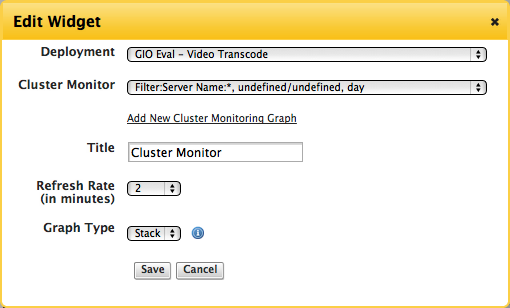
- Cluster Monitor - Choose the Cluster Monitoring graph you created in the Monitoring tab to be used for your Widget or add a new Cluster Monitoring graph.
- Title - Name your Cluster Monitoring Widget.
- Refresh Rate - Specify in minutes how often you want your Cluster Monitoring Widget to be refreshed.
- Graph Type - Choose between Heat Map or Stacked Graph for your Cluster Monitor to be displayed in the Widget.
Click Save.
Your Cluster Monitoring Widget will be editable directly in the Dashboard.
Add a Cluster Monitoring Widget from a Deployment
If a Cluster Monitor does not already exist for a Deployment, you must navigate to a Deployment with running Servers in order to enable Cluster Monitoring.
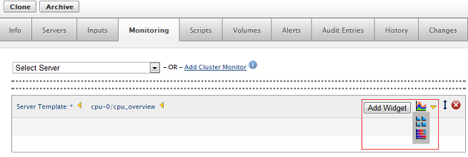
- After choosing a Deployment with running servers, click Add Cluster Monitor
Filter by ServerTemplate, Server, or Tag from the dropdown menu. You can also click Apply without choosing a filter to get all of the Servers in your Deployment to be included in the Cluster Monitor.
- Click Apply.
- Select either a Heat Map or Stacked Graph to view your Cluster Monitor graph.
- Click Save.
- Click Add Widget.
Your Cluster Monitor graph is added as a Widget to the Dashboard. You can then edit your Cluster Monitoring Widget directly in the Dashboard.
Add a Optima Widget
Optima is a product from RightScale that enables you to visualize, forecast, and optimize costs across your entire cloud portfolio. If you are a user of Optima, you can add a widget to view your Optima Dashboard in the RightScale Cloud Management Dashboard. If you are interested in Optima, contact your account manager or sales@rightscale.com. Use the following steps to add a Optima Widget.
- Navigate to Design > Widgets > Custom tab
- Find the RightScale Optima and click the add (+) button.
- Provide a title for the Widget. (e.g. RightScale Optima) and click Save.
- Once the Widget is saved, it is added to the Dashboard Widgets tab.
Add a Security Updates Available Widget
The Security Updates Available
Widget notifies you when servers have Linux security updates available. Use the following steps to add a Security Updates Available Widget to the Dashboard.
- Navigate to Design > Widgets > Custom tab
- Click the Add button.
A dialog box is displayed. Configure the following parameters as desired:
- Title - This will be displayed in the Widget.
- Refresh Rate - Number of minutes between times the Widget will automatically refresh its contents.
Click Save.
The Widget is available in the Widgets tab of the Dashboard.